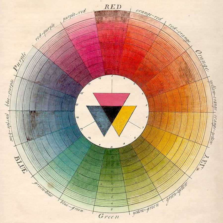
The color wheel.
Know your color wheel! The three primary colors are red, blue, and yellow. These are primary because they cannot be made through combininations of any other colors, but through combinations of these three (and white) every other color can be made, even black. The three secondary colors – green, orange, and purple – are made by combining equal amounts of the pure primary colors.
Blue + yellow = green;
Red + yellow = orange;
Blue + red = purple.
Six tertiary colors, for a total of twelve colors on the color wheel, are made by combining the six primary and secondary colors.
Black is made by combining equal amounts of all three pure primary or secondary colors.
White, artistically and not scientifically speaking, is the absence of all color.
Gray is made by diluting black with white.
Did you know that the color wheel theory was first proposed by Sir Isaac Newton? Brush up on color theory history:
The vibrant color wheels designed by Goethe, Newton, and other theorists of color | Open Culture
Colour wheels, tables, and charts through history | Public Domain Review
Hue, tint, tone, shade.
A color hue is the pure color from the color wheel, undiluted by any additions.
A color tint is the pure color from the color wheel, diluted with white. Color tints form the pastel colors.
A color shade is the pure color from the color wheel, diluted with black. Color shades form the dark colors.
A color tone is the pure color from the color wheel, diluted with gray. Color tones form the muted colors.
Color harmony.
Color harmonies that work well together can be identified from established combinations on the color wheel. Even God uses these combinations consistently in nature, and you can use them successfully too in all your interior decorating and crafting.
The monochromatic scheme is from a single color hue on the color wheel, and usually includes that same hue’s tints, shades, and tones.
The complementary scheme is the two colors opposite each other on the color wheel. Keeping with our blue hue, its opposite color on the color wheel is orange.
The analogous scheme are three colors adjacent to each other on the color wheel. The two colors adjacent to our blue hue, are blue violet and blue green.
The split scheme is similar to the complementary scheme, with this difference. Beginning with our blue hue, we find the opposite color, which is orange. But then we choose the two colors on either side of orange in the color wheel, splitting the complement. The two colors splitting the complement of our blue hue, are yellow orange and red orange.
When I am planning a new quilt, I often use a variation of the complementary, analogous, and split color schemes. I choose my main hue, which would be blue in our example, and choose accent colors from the complement, which would be orange in our example, and its two analogous colors, yellow orange and red orange.
Finally there is the triad color scheme, very common in nature. The triad scheme combines the three colors exactly equidistant from each other on the color wheel. Going back to our blue hue, its equidistant colors are red and yellow.
Neutral color.
A neutral color is a color which pairs well with every other color hue on the color wheel. White, black, and gray, the three neutrals which combine with every color hue to make tints, shades, and tones, are the most common neutrals.
But every color hue has a neutral that pairs with every other color hue without competing with it. Nearly all the neutrals are tones of the original hue.
Yellow’s neutral is ivory, cream, and camel.
Orange’s neutral is tan and brown.
Red’s neutral is maroon.
Purple’s neutral is taupe.
Blue’s neutral is navy.
Green’s neutral is olive.
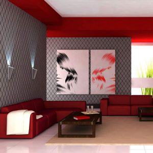
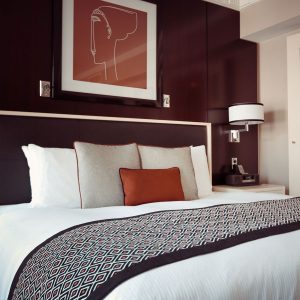
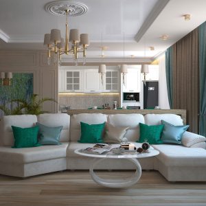
Neutrals are the most important colors in planning color schemes for rooms or quilts. They give the eye and mind a place to rest. If a quilt or room was nothing but color hues, the intensity of the color would create a sense of agitation. Going back to our example photos from nature above, notice how most of them contain a neutral somewhere in the color scheme.
When planning a new quilt, I try to use at least 50% neutrals. With interior design color schemes, less than 50% neutrals can infuse an exciting sense into the space. More than 50% neutrals can infuse a restful sense into the space.
Color value.
A color’s value refers to its relative lightness or darkness. Yellow’s pure hue has a light value, while purple’s pure hue has a dark value. Incorporating a higher value contrast in your color scheme allows some things to stand out. Incorporating a lower value contrast allows everything to blend together. Most successful quilt designs employ a high contrast in value to bring the pattern forward.
If you are unsure if you have your color values in balance in your finished design, take a picture of your design, and then grayscale it in your computer photo editing program. Removing the color hues shines a spotlight on the value, and you can then see if your color values need to be increased or decreased.
Accent color.
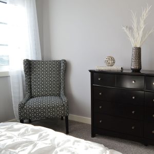
The color wheel can be divided equally between warm and cool colors. The warm colors are yellow, orange, red, and their derivatives. The cool colors are green, blue, and purple, and their derivatives. When I am planning a room design or a quilt design, if the main palette is cool, I always add a warm accent. If the main palette is warm, I always add a cool accent. I find the finished result much more pleasing to the eye. Let’s look at some room examples and quilt examples to see what I am talking about.
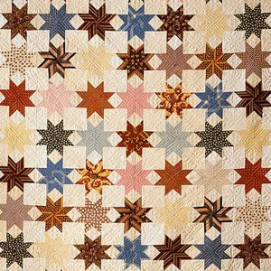
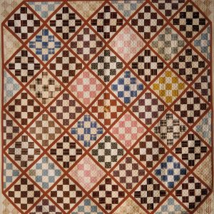
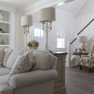
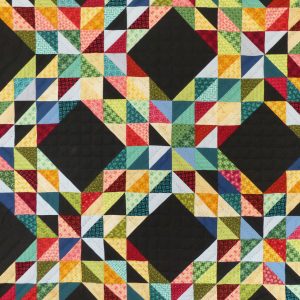
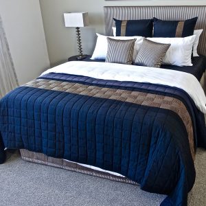
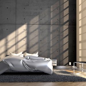
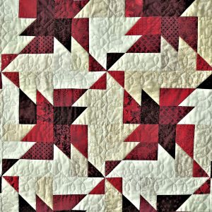
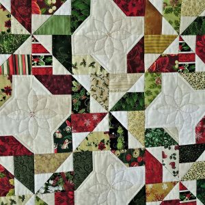
Go back up to the neutral palette rooms illustrating color value. Those rooms, devoid of a color palette and accent, are bland and cold compared to the rooms pictured above. Even the gray neutral palette is far warmer and friendlier feeling with the warm neutral flooring and warm light coming in through the windows. Now let’s look at a quilting example.
This is just a start into the fascinating field of color theory, but it is enough to make your designs sing!
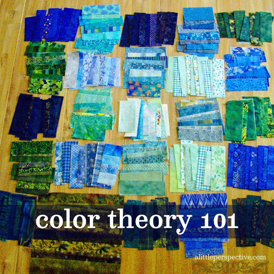
P.S. The pic in the title graphic is of a baby quilt I was making for one of my grandsons. Can you determine the color scheme, neutrals, and opposite accent color? Is the value high or low contrast? Quiz your kids on color theory by going through home decor magazines and nature photography magazines and let them name the color schemes, neutrals, and palettes found in the pictures. And then encourage them to use these color theory principles when creating their own artwork.
















THis is wonderful! SAving!
Thank you so very much Amy! Please do come back again <3